Typography Playground
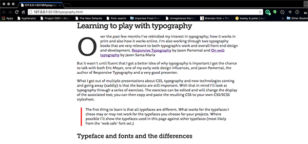
Over the past few months I've rekindled my interest in typography; how it works in print and also how it works online. I'm also working through two typography books that are very relevant to both typographic work and overall front end design and development. Responsive Typography by Jason Pamental, On web typography by Jason Santa Maria and Professional Web Typography by Donny Truong.
But it wasn't until fluent that I got a better idea of why typography is important.I got the chance to talk with both Eric Meyer, one of my early web design influences, and Jason Pamental, the author of Responsive Typography and a very good presenter.
What I got out of multiple presentations about CSS, typography and new technologies coming and going away (saddly) is that the basics are still important. With that in mind I'll look at typography through a series of exercises. The exercises can be edited and will change the display of the associated text; you can then copy and paste the resulting CSS to your own CSS/SCSS stylesheet.
The first thing to learn is that all typefaces are different. What works for the typefaces I chose may or may not work for the typefaces you choose for your projects. Where possible I'll show the typefaces used in this page against other typefaces (most likely from the 'web safe' font set.)
Why worry about typography on the web?
Universal Typography -- Tim Brown
I love the web and I've been working on digital content for almost 20 years. While I agree with the universality and accessibility requirements for the web (it should be acessible by anyone anywhere, regardless of disability or network connection) the content doesn't have to be boring or plain
Whether we are reading a paper book or a web page or a iBook or Kindle ebook, typography still matters and it's still an important part of the design process.
For the longest time I've heard that the web is not print and that we shouldn't look at books as sources for web design inspiration. This may be true: the web is not print. But we're getting to the point where CSS on its own or a combination of CSS and Javascript will gives a large part of what we see in print in a way that won't look terrible in older browsers, when the user access it with assistive technology, or when CSS and Javascript are disabled.
I started taking a serious look at typography about 3 years ago. I'm not an expect and I'm most definitely not a professional but I'm learning and the more I learn the more I think we can use the full range of web technologies to enhance the text and the reading experience for our users.
Definitions and Terminology
Before we dive into Type selection we'll do a few things: clear terminology and setup some common definitions to work from. The first one is the diference between typeface and font and then we'll dive into a short (and incomplete) glossary of typographical terms
Font versus Typeface
I've been guilty of this: use font and type face interchangeably. They are most definitely not the same thing and should not be used as if they are.
Typeface refers to the design of the font.
Fonts is the media that contains typefaces and allows you use them in your projects.
The best analogy I've heard about is that the relationship between typeface and font is analogous to the relationship between music and mp3. One is the content and the other is the media content is delivered in.
For more information, check out font or typeface and Styles, Weights, Widths — It’s All in the (Type) Family both at Fontfeed.com.
Font Glossary

definitions taken, in part, from Fontshop's Typography Glossary and Typography Deconstructed's Type Glossary
- Uppercase
- The capitals in a typeface. The name refers to the days of metal type, as the capitals were kept in the upper part of the type case.
- The capital letters of the alphabet are uppercase glyphs. Uppercase letters are normally used at the beginning of sentences and as the first letter of proper names.
- Lowercase
- The small letters in a typeface. The name refers to the days of metal type, as the small letters were kept in the lower part of the type case.
- The little letters or non-capital letters of the alphabet are lowercase glyphs. They make up the bulk of written text, with uppercase or capital letters used primarily only to start sentences or proper names.
- Typeface
- An artistic interpretation, or design, of a collection of alphanumeric symbols. A typeface may include letters, numerals, punctuation, various symbols, and more — often for multiple languages. A typeface is usually grouped together in a family containing individual fonts for italic, bold, condensed, and other variations of the primary design. Even though its original meaning is one single style of a type design, the term is now also commonly used to describe a type family (usually only with the basic styles regular, italic, bold, bold italic).
- Font
- (also, fount) A collection of letters, numbers, punctuation, and other symbols used to set text (or related) matter. Although font and typeface are often used interchangeably, font refers to the physical embodiment (whether it’s a case of metal pieces or a computer file) while typeface refers to the design (the way it looks). A font is what you use, and a typeface is what you see.
- Ascender
- Any part in a lowercase letter that extends above the x-height, found for example in ‘b’, ‘d’, ‘f’, ‘h’, ‘k’, etc. Some types of ascenders have specific names.
- The ascenders of some letters may touch or almost touch letters in the line above causing awkward or distracting patterns. This is most likely to happen or be obvious when a line of text with tall ascenders is below a line of text with long descenders. To resolve the problem of touching ascenders and descenders you can: Increase the leading (line spacing) between lines of type; Choose a different typeface; For headlines and subheads, some careful editing/re-wording can eliminate the problem; Changing the alignment of the text may also help
- Axis
- An imaginary line drawn from top to bottom of a glyph bisecting the upper and lower strokes is the axis. The slant of the axis (or lack thereof) often helps determine the type classification.
- An imaginary line drawn from top to bottom of a glyph bisecting the upper and lower strokes is the axis. For typefaces that exhibit changes in the thickness of curved strokes, the inclination of the axis of the lowercase o is used to measure the angle of stress. A completely vertical axis indicates a design with an angle of 0 or vertical stress. When the axis leans to the left or right the design has angled (positive or negative) stress. Early styles of typefaces generally shared similiar axis or stress angles.
- The axis or design axis is also an adjustable attribute of some fonts, such as Multiple Master fonts. Adjusting the design axis results in variations in the weight, width, size, and other features of the typeface.
- Bracket
- The bracket is a curved or wedge-like connection between the stem and serif of some fonts. Not all serifs are bracketed serifs.
- Baseline
- The imaginary line upon which the letters in a font appear to rest.
- Cap Height
- The height from the baseline to the top of the uppercase letters (not including diacritics).
- Beak
- A triangular, serif-like protrusion at the end of a stroke in certain serif type designs.
- Spine
- The main curved stroke in the letter ‘S’ and ‘s’.
- Counter
- The enclosed or partially enclosed circular or curved negative space (white space) of some letters such as d, o, and s.
- Descender
- Any part in a lowercase letter that extends below the baseline, found for example in g, j, p, q, y, etc. Some types of descenders have specific names.
- For contrast, see Ascender
- Diacritics
- A diacritic is a ancilliary mark or sign added to a letter. Accents are one type of diacritics. In the Latin alphabet their function is to change the sound value of the letters to which they are added; in other alphabetical systems like Arabic or Hebrew they may indicate sounds (vowels and tones) which are not conveyed by the basic alphabet.
- Shoulder
- The curved part projecting downward from a stem in the lowercase ‘h’, ‘m’, ‘n’.
- Small Caps (SC)
- Small caps are capital letters that are approximately as high as the x-height of the lowercase letters. When properly designed small caps are absent in the selected font, many applications can create small caps by scaling down the capitals. However this makes these fake small caps too light and narrow, and they don’t harmonize properly with the lowercase. Originally small caps were only available for the roman text weight(s), but nowadays many type families also have them for the italic styles and the bolder weights.
- When small caps are built-in as OpenType features, certain (older) operating systems and applications will not be able to access them.
- Spacing
- Spacing refers to the distribution of horizontal space on both sides of each character in a font to achieve a balanced and even texture. Spacing problems in difficult letter combinations (exceptions) are solved with kerning. Well-spaced fonts need comparatively less kerning pairs.
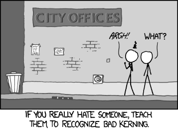
- Kerning
- Kerning refers to the horizontal space between individual pairs of letters (a kerning pair), and is used to correct spacing problems in specific letter combinations like “VA”. Well-spaced fonts need comparatively less kerning pairs. Fonts that are properly kerned appear evenly spaced without large open gaps of white space between any two characters.
- Leading
- Linespacing
- Its original meaning is increasing the vertical space between lines of metal type by literally inserting lead strips. In the digital age it now means the vertical space between lines of text, from baseline to baseline.
- Serif
- In typography, a serif is the little extra stroke found at the end of main vertical and horizontal strokes of some letterforms.
- Sans Serif
- Typeface that without extensions at the letter's termination points. Sans serif type lends a clean and sharp appearance to the text, and is suitable for headlines or highlighted matter. Such type, however, is known to retard readability of large bodies of text, specially when less than 10 point in size.
- Literally 'without serif'.
- Tail
- The descending, often decorative stroke on the letter ‘Q’.
- X-Height
- The height of the lowercase letters, disregarding ascenders or descenders, typically exemplified by the letter x. The relationship of the x-height to the body defines the perceived type size. A typeface with a large x-height looks much bigger than a typeface with a small x-height at the same size.
- Foundry
- A company that designs and/or distributes typefaces; a type manufacturer. The name originated in the days of metal type when type was made from molten lead.
There are many more terms to define but I believe these are enough to get us started. Check the references listed at the beginning of the glossary for additional terms.
Font Selection
All type shares characteristics. We'll look at some of them before we dive into selecting font stacks and other type related element. As we move along we'll discover that these elements are all interrelated and that changing one of these elements will force changes in others too.
X-height
When you look at your text what is the size of the lowercase glyphs/letters in relation to uppercase? In different fonts the height of lowercase glyphs (measured by the x-height) can be different, some of them being barely half the uppercase height and in others being as tall as two thirds of the uppercase height.
When looking at type, particularly when you're testing your content in your chosen typeface and size, make sure that the size is not too small to read. When the height of the lowercase gets too small for the size you chose it gets too hard to read.
Glyph Apertures
Aperture refers to the spacing between open points in letters like 'c', 'e' or 'a'. If these apertures are too close the letter can be confused with a lowercase 'o' and make the reader's experience harder than it needs to be
Even Spacing
Make sure that the space between the glyphs and the width of the glyps in the font you choose are constant and not too far or to close to each other. This constant spacing will make your text easier to read or scan online
Clear Terminals
Terminals are the flourishes at the end of the letters a, c, f, j, r, and y. They can be classified according to the shape: ball (circular), beak (spur), and teardrop (globular).
In long-form text, letters with clear terminals (distinguishable shapes of ball, beak, or teardrop) are easier to spot; therefore, they are more readable than letters with lacking terminals.
Distinguishable Ascenders & Descenders
Ascenders (the lines above the main body of a glyp) and descenders (the line below) help make characters easier to read. When you're choosing typefaces, contrast sans serif versus serif type to see the difference in how the ascenders and descenders look. For a bad example look at helvetica.
Styles & Weights
When we see bold and italics on the web, we usually see the browser's interpretation of bold and italics not the actual italic and bold versions of the chosen typeface.
To make sure that this doesn't happen to you, make sure that the typefaces you work with have at least 4 versions:
- Regular
- Bold
- Italic
- Bold Italic
If one of the style fonts are not available then you're at the browsers' mercy as to how bold and italics will render for your page.
Contrast
In this context, contrast refers to the differences between thick and thin strokes of the font. When working with body copy the thin strokes may disappear or the think strokes may overwhelm the rest of the text.
To make sure none of these situations happen pick a font with low or no contrast.
Context
Until now we've looked at the technical aspects of type where the typeface will be used is also important. Context has more to do with how the type feels. If you're developing responsive sites, does the type feel too tight or constrained in larger screens? Does it feel too loose in smaller displays? The goal is to find typeface that works consistently accross your target devices.
Font stacks
Unless you're using one of the universal fonts, those available everywhere, you will most likely have to plan for what happens if your browser cannot load the font because your internet connection just died or you got caught using a font that you were not licensed to use. That's where you use the font stack.
At its simplest, the stack is the list of fonts that you want to use in your page going from left to right. For example in the following font stack:
html {
  font-family: 'Museo Sans', Verdana, sans-serif;
}
The browser will use Museo Sans, if is available in a format that the browser can read, if it isn't then the browser will use Verdana and... in the unlikely event that verdana is not available the browser will use the system's default sans serif font.
Why is this important, you may be asking. Because not all fonts are the same. Even fonts that look very similar may be different enough to cause problems with your layout. Let's look at the same Lorem Ipsum text in two different fonts.
The first example will use Stone Humanist, the font I chose for the body text in this document.
Bacon ipsum dolor amet sint t-bone et aliquip proident ex dolor. Landjaeger tail duis, nostrud brisket strip steak shankle turducken. Laborum sausage aliqua, non quis laboris est brisket reprehenderit ball tip cow capicola. Meatloaf commodo jerky adipisicing.
Ad short ribs adipisicing, lorem beef elit eiusmod laborum pork belly labore. Aliqua jowl id, ut cupim in swine short ribs. Nulla short loin enim drumstick in, minim rump pancetta. Fatback qui corned beef, strip steak spare ribs elit minim pig. Cupidatat aliquip pariatur, pork belly tenderloin flank cillum.
Example usinng Stone Humanist
The second example uses Verdana, a font created for and released by Microsoft in 1996.
Bacon ipsum dolor amet sint t-bone et aliquip proident ex dolor. Landjaeger tail duis, nostrud brisket strip steak shankle turducken. Laborum sausage aliqua, non quis laboris est brisket reprehenderit ball tip cow capicola. Meatloaf commodo jerky adipisicing.
Ad short ribs adipisicing, lorem beef elit eiusmod laborum pork belly labore. Aliqua jowl id, ut cupim in swine short ribs. Nulla short loin enim drumstick in, minim rump pancetta. Fatback qui corned beef, strip steak spare ribs elit minim pig. Cupidatat aliquip pariatur, pork belly tenderloin flank cillum.
Example using Verdana
Notice, in particular, how Verdana's characters are wider and therefore make the line have less content when compared with Stone Humanist. As a further experiment change the front in Example 2-2 from Verdana to Arial and see the difference.
"Web Safe" Fonts
Ever since browsers started using fonts they;ve been able to use fonts available on the user's system. These are the "web safe" fonts.
CSS Font Stack presents a list of some of the most common desktop fonts that are installed in Macintosh and Windows operating systems. As you can see there are a few fonts that are really safe to use across platforms.
This is yet another consideration when building our font stack. If we build backups other than generic fonts we need to be careful to pick fonts that are wide used or pick 2 or more options to cover both Windows and Macintosh cases.
Generic font families
Most of the time we have a certain font selected for our project and most of the time they will work ok. But what happens when they don't?
As we saw in the earlier examples the typeface you choose will affect number of words you can fit in a line of text and the way the font writes on screen may look different with the same line height
CSS defines a number of generic font families for use with your content. These families are (with defnitions taken from the CSS 2.1 specification):
- serif
- Glyphs of serif fonts, as the term is used in CSS, tend to have finishing strokes, flared or tapering ends, or have actual serifed (including slab serifs). Serif fonts are typically proportionately-spaced. They often display a greater variation between thick and thin strokes than fonts from the 'sans-serif' generic font family. CSS uses the term 'serif' to apply to a font for any script, although other names may be more familiar for particular scripts, such as Mincho (Japanese), Sung or Song (Chinese), Totum or Kodig (Korean). Any font that is so described may be used to represent the generic 'serif' family.
- sans-serif
- Glyphs in sans-serif fonts, as the term is used in CSS, tend to have stroke endings that are plain -- with little or no flaring, cross stroke, or other ornamentation. Sans-serif fonts are typically proportionately-spaced. They often have little variation between thick and thin strokes, compared to fonts from the 'serif' family. CSS uses the term 'sans-serif' to apply to a font for any script, although other names may be more familiar for particular scripts, such as Gothic (Japanese), Kai (Chinese), or Pathang (Korean). Any font that is so described may be used to represent the generic 'sans-serif' family.
- cursive
- Glyphs in cursive fonts, as the term is used in CSS, generally have either joining strokes or other cursive characteristics beyond those of italic typefaces. The glyphs are partially or completely connected, and the result looks more like handwritten pen or brush writing than printed letterwork. Fonts for some scripts, such as Arabic, are almost always cursive. CSS uses the term 'cursive' to apply to a font for any script, although other names such as Chancery, Brush, Swing and Script are also used in font names.
- fantasy
- Fantasy fonts, as used in CSS, are primarily decorative while still containing representations of characters (as opposed to Pi or Picture fonts, which do not represent characters).
- monospace
- The sole criterion of a monospace font is that all glyphs have the same fixed width. (This can make some scripts, such as Arabic, look most peculiar.) The effect is similar to a manual typewriter, and is often used to set samples of computer code.
Using a generic family as the last item in your font stack is essential. The system is guaranteed to be available and you can style your content with this in mind. It also makes your CSS less succeptuble to slow connections or network failures.
Additional Considerations
There are a couple more elements to consider when selecting a font. They may not seem as important but when put together with evcerything else we'll discuss in this page, it's a lot more important than we give it credit for.
Font size
Even when working with Desktop Operating Systems alone a font may look very different. It doesn't necessarily have anything to do with the design and all with how the operating system renders fonts and it may not even happen but this is something to consider when testing.
Smaller sizes may cause font details to dissapear as the font grows smaller. This may affect the typeface you use for your body text, particularly in smaller devices.
Fonts have become more interesting when particularly since Apple released 'Retina' iPhones and iPads and Android phones have been released with even higher pixel density. While the higher density allows you to use more typefaces, your design must still consider browsers with lower pixel density in your design.
Line height
In CSS line-height control the vertical space between lines. It can help readability and make it easier for people with dissabilities to engage with your content.
p {
  font: 1em/1.5 arial, helvetica, sans-serif;
}
Which is equivalent to this, much more verbose, syntax:
p {
  font-family: arial, helvetica, sans-serif;
  font-size: 1em;
  line-height: 1.5;
}
I personally prefer the second syntax. It's explicit in telling you what each attribute controls and it saves you from having to remember what does each part of the expression means. That said you're more than welcome to use either syntax.
So why do we care about line height. In the example below change the line height attribute, play with values from 1 to 2 or even 3 and see the difference. Which one is more comfortable to read?
Bacon ipsum dolor amet sint t-bone et aliquip proident ex dolor. Landjaeger tail duis, nostrud brisket strip steak shankle turducken. Laborum sausage aliqua, non quis laboris est brisket reprehenderit ball tip cow capicola. Meatloaf commodo jerky adipisicing.
Ad short ribs adipisicing, lorem beef elit eiusmod laborum pork belly labore. Aliqua jowl id, ut cupim in swine short ribs. Nulla short loin enim drumstick in, minim rump pancetta. Fatback qui corned beef, strip steak spare ribs elit minim pig. Cupidatat aliquip pariatur, pork belly tenderloin flank cillum.
Example demonstrating what happens when you change line-height
Line width
Anything from 45 to 75 characters is widely regarded as a satisfactory length of line for a single-column page set in a serifed text face in a text size. The 66-character line (counting both letters and spaces) is widely regarded as ideal. For multiple-column work, a better average is 40 to 50 characters.
Robert Bringhurst’s The Elements of Typographic Style, (p.26)
Until I started working with web type I had never considered line length as an element when building content. But it makes sense, the longer a line of text is the more we need to be mindful when working with it. In the example below, the text at the same width looks significantly different when we adjust the line height.
Bacon ipsum dolor amet sint t-bone et aliquip proident ex dolor. Landjaeger tail duis, nostrud brisket strip steak shankle turducken. Laborum sausage aliqua, non quis laboris est brisket reprehenderit ball tip cow capicola. Meatloaf commodo jerky adipisicing.
Ad short ribs adipisicing, lorem beef elit eiusmod laborum pork belly labore. Aliqua jowl id, ut cupim in swine short ribs. Nulla short loin enim drumstick in, minim rump pancetta. Fatback qui corned beef, strip steak spare ribs elit minim pig. Cupidatat aliquip pariatur, pork belly tenderloin flank cillum.
What happens when you change line-height for text of a given width
So what should the stack look like?
So, after all these conversations about different types of typefaces, fonts, availability and when to use and not to use them, what should a good font stack look like?
As with many thing in the web it depends. If you were given fonts as part of your design brief then you should follup up with the designer regarding fall back fonts.
If this is your design then I'd suggest sites like Fonts in use or Typewolf to see how other people are using fonts. Another way is to identify a font you like (like I did with the body font for this page), research whether it's available as a web font and how much would it cost to license.
Once you know what font you want to use, there are services like Typecast to see what the font will look like in an actuall web page... you can even add chunks of your own content to get a more acurate picture of what the typeface will look like with your content.
My default font stack for this project looks like this:
html {
  font-family: 'Stone-Humanist', arial, sans-serif;
}
I use a different stack for headings and this will be discussed when we talk about headings in more detail.
Loading Fonts
Now that we have a better idea of what fonts we want to use and the font stack we'll see how to load them into the page. We'll explore 3 ways: local loading using the @font-face syntax, loading fonts using the Google font API, using Google's Web Font Loader and a new tool called Font Face Observer
@font-face
We have been able to use fonts on our web content since the days of IE 3 (3.5 for Macintosh if I remember correctly) but we've always had to contend with font creators and foundries fear of piracy. It's only recently that they have relented and allowed their fonts to be used. The basic syntax, covering all modern browsers, looks like this:
@font-face {
    font-family: 'stone-sans-webfont';
    src: url('../path-to-font-file.eot');
    src:
      url('../path-to-font-file.eot?#iefix')
        format('embedded-opentype'),
      url('../path-to-font-file.woff2')
        format('woff2'),
      url('../path-to-font-file.woff')
        format('woff'),
      url('../path-to-font-file.ttf')
        format('truetype'),
      url('../path-to-font-file.svg#stone-sans-webfont')
        format('svg');
    font-weight: normal;
    font-style: normal;
}
And then we associate the font with CSS like we normally would matching the font-family attribute in the @font-face declaration with the font-family attribute of the element where we want to use it:
html {
  font-family: 'stone-sans-webfont', arial, sans-serif;
}
Since we want to avoid faux bold and faux italics in our content, we add the bold and italics versions of our font to the page and then match them to the correct attributes with selectors similar to this:
strong {
  font-family: 'Stone-Humanist-Semi';
}

em {
  font-family: 'Stone-Humanist-Ita';
}

/*
  When using both we don't care
  what order they are used in
*/
strong em,
em strong {
  font-family: 'Stone-Humanist-SemiItalic';
}
Where Stone-Humanist-Semi is our (semi)bold font, Stone-Humanist-Ita is italics and Stone-Humanist-SemiItalic is the semibold italics combination. Since <b> and <i> have different semantic meaning in HTML5 I've chosen not to style them.
Some things to keep in mind
Adding the font to your site/book/app adds to the overall file size. Depending on the font this may increase the size of your project considerably. Taking Gentium as an example, the font supports Latin, Greek and Cyrillic character sets but it weighs a hefty 500k for the regular font (in one format out of the 5 formats needed to support multiple browsers/devices). Add Bold, Italic and you get 1.5 Megabytes just for the font! And it may not be the only font you use in the project.
The flipside to this issue of size is that embedding the fonts means they are always available to desktop and mobile browsers readers that support embedding (and it should be all of them.) Choosing what browsers and what versions to support is a different story.
Google Fonts API
Google has two ways of using web fonts, the first one is directly through their API. Using Google's font API is a two step process. First add the font to your html head element with the following syntax (using Tangerine as an example):
<link rel="stylesheet" type="text/css" href="http://fonts.googleapis.com/css?family=Tangerine">The link produces a CSS @font-face declaration that we can use in our CSS as normal. The version produced in Chrome and Firefox uses the woff2 format
@font-face {
  font-family: 'Tangerine';
  font-style: normal;
  font-weight: 400;
  src: local('Tangerine'), url(http://fonts.gstatic.com/s/tangerine/v6/HGfsyCL5WASpHOFnouG-RJBw1xU1rKptJj_0jans920.woff2) format('woff2');
  unicode-range: U+0000-00FF, U+0131, U+0152-0153, U+02C6, U+02DA, U+02DC, U+2000-206F, U+2074, U+20AC, U+2212, U+2215, U+E0FF, U+EFFD, U+F000;
}
While Safari uses True Type to render the font.
@font-face {
  font-family: 'Tangerine';
  font-style: normal;
  font-weight: 400;
  src: local('Tangerine'), url(http://fonts.gstatic.com/s/tangerine/v6/HGfsyCL5WASpHOFnouG-RCZ2oysoEQEeKwjgmXLRnTc.ttf) format('truetype');
}
As you can see the advantage of using the APi is that we don't need to use multiple formats in our @font-face declaration. Google takes care of that for us.
The obvoius disadvantage is that this only works online. That's why a fallback option or options is even more important when working with the API. If we're offline or connectivity is limited we want a good fallback font.
Google web font loader
One of the things neither the font API or directly downloading the content doesn't address is the "flash of unstyled text." According to the Typekit Help Center:
Fonts are loaded as assets into a web page—just like images or video. Depending on your browser or your connection speed, they can load quickly or lag behind the rest of the page. Different browsers handle font loading differently; for example, Safari and Chrome will refrain from displaying text set in a web font until the font has loaded, while Internet Explorer won’t show anything on the page until the font loads. Meanwhile, Firefox will display the site with the fallback fonts in the font stack, and then switch to the linked fonts after they’ve finished loading. This results in a flash of unstyled text, or FOUT.
Typekit, in collaboration with Google, has created loader library to make working with type easier. It works by adding scripts to the page that load the library and tell it what fonts to download and use. For example to load the Droid Sans font from Google you'd use code like this:
<script src="https://ajax.googleapis.com/ajax/libs/webfont/1.5.10/webfont.js"></script>
<script>
  WebFont.load({
    typekit: {
      id: 'xxxxxx'
    },
    custom: {
      families: ['Droid Sans', 'Source Code Pro'],
    },
    google: {
      families: ['Droid Sans', 'Droid Serif'],
      text: 'abcdedfghijklmopqrstuvwxyz!'
    },
    fontdeck: {
      id: 'xxxxx'
    },
    monotype: {
      projectId: 'xxxxxxxx-xxxx-xxxx-xxxx-xxxxxxxxxxxx',
      version: 12345 // (optional, flushes the CDN cache)
    }
  });
</script>
Or using asynchronous loading:
<script src="https://ajax.googleapis.com/ajax/libs/webfont/1.5.10/webfont.js"></script>
<script>
  WebFontConfig = {
    google: { families: [ 'Lora:400,700,400italic,700italic:latin' ] }
  };
  (function() {
    var wf = document.createElement('script');
    wf.src = ('https:' == document.location.protocol ? 'https' : 'http') +
      '://ajax.googleapis.com/ajax/libs/webfont/1/webfont.js';
    wf.type = 'text/javascript';
    wf.async = 'true';
    var s = document.getElementsByTagName('script')[0];
    s.parentNode.insertBefore(wf, s);
  })();

<noscript>
  <link href='http://fonts.googleapis.com/css?family=Lora:400,700,400italic,700italic' rel='stylesheet' type='text/css'>
</noscript>
For an explanation of the values for each foundry check the Font Loader's readme file in Github.
The font loader creates a set of events, both CSS and Javascript, for developers to interact with. This is similar to the way Modernizr handles feature detection. The Javascript classes are:
- loading - This event is triggered when all fonts have been requested.
- active - This event is triggered when the fonts have rendered.
- inactive - This event is triggered when the browser does not support linked fonts or if none of the fonts could be loaded.
- fontloading - This event is triggered once for each font that's loaded.
- fontactive - This event is triggered once for each font that renders.
- fontinactive - This event is triggered if the font can't be loaded.
CSS events are implemented as classes on the html element. The following classes are set on the html element and correspond to the descriptions above:
- .wf-loading
- .wf-active
- .wf-inactive
- .wf-<familyname>-<fvd>-loading
- .wf-<familyname>-<fvd>-active
- .wf-<familyname>-<fvd>-inactive
The <familyname> placeholder will be replaced by a sanitized version of the name of each font family in lowercase with only alphanumeric characters. For example, Droid Sans becomes droidsans. The <fvd> placeholder is a Font Variation Description, a shorthand for describing the style and weight of a particular font.
So why would we use the Font Loader?
In short: to make the user's experience less jarring. Since fonts are downloaded as any other resource in your web page. If we use the following font stack: 'stone-sans-webfont', arial, sans-serif, we can then use the Font Loader Defined classes to make the transition to our fonts smoother and better looking. Let's look at one possibility:
.wf-inactive body{
  font-family: arial, sans-serif;
  line-height: 1.4em;
}

.wf-active body {
  font-family: 'stone-sans-webfont', arial, sans-serif;
  line-height: 1.3
}
.wf-inactive indicates that loading the font or fonts (in this case we are using one) has not started. To make sure that the user doesn't see a system fault we provide a fallback option while the web font(s) are loading. This may be an instant or maybe several seconds in a slow or congested network connection (try Starbucks on a Sunday afternoon.)
Once the font(s) load, the class will switch to .wf-active where we put out web font stack and attributes related to font. In this case I only added a different line-height attribute to the selector but you can be as detailed as you want.
One last detail: What happens if Javascript is disabled?
If you're fonts are loaded from google you can revert back to using the Google API to load your fonts. You can do something like:
<noscript>
  <link href='http://fonts.googleapis.com/css?family=Roboto:700italic,300,700,300italic' rel='stylesheet' type='text/css'>
</noscript>
Font Face Observer
As good as the Webfont Loader is good it causes some Flash of Invisible text when the fonts load and the browser switches from the system fonts to the webfonts it just loaded. The script for the Webfont Loader must be placed in the head of the document with all the performance pitfalls inherent to it.
Font Face Observer, a fairly new delivery mechanism developed by Adobe Typekit engineer Bram Stein, uses JavaScript’s scroll events to load and monitor web fonts. Unlike the Web Font Loader, the Font Face Observer can be referenced at the end of document to avoid the extra overhead. Scott Jehl's approach, as documented in the Filament's Group blog and is the system we'll discuss below. The full page is shown below and will be explained as we go along.
<!DOCTYPE html>
<!--#if expr="$HTTP_COOKIE=/fonts\-loaded\=true/" -->
<html lang="en" class="fonts-loaded">
<!--#else -->
<html lang="en">
<!--#endif -->
<head>
  <meta charset="utf-8">
  <title></title>
  <meta name="viewport" content="width=device-width">
  <style>
  @font-face {
    font-family: 'Lora';
      src: url('lora-regular.woff2') format('woff2'),
           url('lora-regular.woff') format('woff'),
           url('lora-regular.ttf') format('truetype');
    font-weight: 400;
    font-style: normal;
  }
  @font-face {
    font-family: 'Lora';
      src: url('lora-italic.woff2') format('woff2'),
           url('lora-italic.woff') format('woff'),
           url('lora-italic.ttf') format('truetype');
    font-weight: 400;
    font-style: italic;
    }
    body {
        font-family: serif;
  }
    .fonts-loaded body {
        font-family: Lora, serif;
  }
</style>
</head>
<body>
    <p><!-- paragraph text --></p>
    <script src="fontfaceobserver.js"></script>
    <script>
    (function( w ){
    if( w.document.documentElement.className.indexOf( "fonts-loaded" ) > -1 ){
        return;
    }
    var font1 = new w.FontFaceObserver( "Lora", {
        weight: 400
    });
    var font2 = new w.FontFaceObserver( "Lora", {
        weight: 400,
        style: "italic"
    });
    w.Promise
        .all([font1.check(), font2.check()])
        .then(function(){
            w.document.documentElement.className += " fonts-loaded";
        });
    }( this ));
    </script>
</body>
</html>
The first thing we do is to use Server Side Includes, a way to have the server generate pieces of content for the web, to add the fonts-loaded CSS class if the corresponding cookie has already been set. In this way the loader will only use the fonts if they've been already been loaded, otherwise it will not add the class and the process will continue.
<!--#if expr="$HTTP_COOKIE=/fonts\-loaded\=true/" -->
<html lang="en" class="fonts-loaded">
<!--#else -->
<html lang="en">
While still in the head of the document we load our fonts using the @font-face syntax we discussed earlier and associate the fonts with the css needed. Note that we have two classes for the body, a plain one where only system fonts are used and a version with the fonts-loaded class where the webfont is the primary and the system font is our backup.
  <style>
  @font-face {
    font-family: 'Lora';
      src: url('lora-regular.woff2') format('woff2'),
       url('lora-regular.woff') format('woff'),
       url('lora-regular.ttf') format('truetype');
    font-weight: 400;
    font-style: normal;
  }
  @font-face {
    font-family: 'Lora';
      src: url('lora-italic.woff2') format('woff2'),
       url('lora-italic.woff') format('woff'),
       url('lora-italic.ttf') format('truetype');
    font-weight: 400;
    font-style: italic;
  }

  body {
    font-family: serif;
  }
  .fonts-loaded body {
    font-family: Lora, serif;
  }
</style>
At the bottom of our pages, along with all the other scripts, we add a link to the fontfaceobserver library. The second script begins with a conditional check to see if the class-loaded class hs been added to the root element (html); if it has been then quit, there is nothing left to do.
We next define variables for each of the fonts we will use in our document. This will be used in the last part of the script, discussed below.
<script src="fontfaceobserver.js"></script>
<script>
(function( w ){
  if( w.document.documentElement.className.indexOf( "fonts-loaded" ) > -1 ){
      return;
  }
  var font1 = new w.FontFaceObserver( "Lora", {
      weight: 400
  });
  var font2 = new w.FontFaceObserver( "Lora", {
      weight: 400,
      style: "italic"
  });
The last part of the script uses a JavaScript promise. Once both promises fulfill it will add the fonts-loaded class to the document (root) element, in this case, html.
w.Promise
  .all([font1.check(), font2.check()])
  .then(function(){
      w.document.documentElement.className += " fonts-loaded";
  });
}( this ));
    </script>
The next result is that the fonts will be loaded asynchronously and that the system font assigned to an element will only change after the font has loaded. This prevents flashes of unstyled content and flashes of invisible content. But in the end which font loading strategy you use is up to you.
Links and Resources
- Delivering Web Fonts chapter from Professional Web Typography
- Font Loading Revisited with Font Events
- SSI instructions for Apache HTTPD
- SSI instructions for Nginx
Paragraph styling
Most the time we spend engaged with text is with paragraphs and that's where I put a lot of my research time when working on a new project. You may be asking why put so much work on how the paragraphs look... As you will see in the example below there are many elements that are involved in controlling paragraph appearance.
Bacon ipsum dolor amet sint t-bone et aliquip proident ex dolor. Landjaeger tail duis, nostrud brisket strip steak shankle turducken. Laborum sausage aliqua, non quis laboris est brisket reprehenderit ball tip cow capicola. Meatloaf commodo jerky adipisicing.
Ad short ribs adipisicing, lorem beef elit eiusmod laborum pork belly labore. Aliqua jowl id, ut cupim in swine short ribs. Nulla short loin enim drumstick in, minim rump pancetta. Fatback qui corned beef, strip steak spare ribs elit minim pig. Cupidatat aliquip pariatur, pork belly tenderloin flank cillum.
Bacon ipsum dolor amet sint t-bone et aliquip proident ex dolor. Landjaeger tail duis, nostrud brisket strip steak shankle turducken. Laborum sausage aliqua, non quis laboris est brisket reprehenderit ball tip cow capicola. Meatloaf commodo jerky adipisicing.
Ad short Wibs adipisicing, lorem beef elit eiusmod laborum pork belly labore. Aliqua jowl id, ut cupim in swine short ribs. Nulla short loin enim drumstick in, minim rump pancetta. Fatback qui corned beef, strip steak spare ribs elit minim pig. Cupidatat aliquip pariatur, pork belly tenderloin flank cillum.
Playing with paragraph type
With the content above we can now start playing with type. Do the following activities to get a feel for how much type can change:
- Change the font-size on
div#example4 p:first-childto 1.5em - Does the size of the first paragraph change your reaction to it? Does size matter?
- Remove the reference to "Stone Humanist" to see what would the text look like in Arial
- Remove the reference to Arial to see what the text would look like in the system's Sans Serif font
- What are the differences between the three fonts?
- Change the font-size attribute to 1.5em and the line-height to 1 Is it harder to read?
- Change the line-height to 1.5. Does it get easier?
- Chang the reference to "Stone Humanist" to Verdana. Can you describe the changes?
- Does the line height change how easy or hard it is to read the text?
- Change the width attribute of
div#example4to 50% - Does the text become harder to read as it gets narrower?
- Change the word spacing from normal to .25em
- Change the word spacing from .25em to -.25em
- Does the text become harder to read as it gets sspread further apart? As it gets condensed together?
- Change the letter spacing from 0 to .25em.
- Change the letter spacing from .25em to -.25em
- Does the text become harder to read as it gets sspread further apart? As it gets condensed together?
The typeface you select does make a difference. While we may not conciously notice how the text changes the changes affect the way text looks and the way we interact with it. I know I hit you with a lot of activities and questions for this little paragraph exercise so feel free to play with some, all or none of the activities above.
But whether you use them or not, you get the idea of how much work goes into making paragraphs read well.
Drop caps
Most (if not all) of us have seen the big initial capital letter on the first paragraph of a chapter. We can do th is with CSS. One version of the effect looks like the code below using first--of-type and first-letter to identify the first letter of the first paragraph and the styles to apply to t his pseudo element
p:first-of-type:first-letter {
  font-size: 3em;
  line-height: 0.9em;
  float: left;
  padding-right: 0.15em;
}
Bacon ipsum dolor amet sint t-bone et aliquip proident ex dolor. Landjaeger tail duis, nostrud brisket strip steak shankle turducken. Laborum sausage aliqua, non quis laboris est brisket reprehenderit ball tip cow capicola. Meatloaf commodo jerky adipisicing. Ad short ribs adipisicing, lorem beef elit eiusmod laborum pork belly labore. Aliqua jowl id, ut cupim in swine short ribs. Nulla short loin enim drumstick in, minim rump pancetta. Fatback qui corned beef, strip steak spare ribs elit minim pig. Cupidatat aliquip pariatur, pork belly tenderloin flank cillum.
Bacon ipsum dolor amet sint t-bone et aliquip proident ex dolor. Landjaeger tail duis, nostrud brisket strip steak shankle turducken. Laborum sausage aliqua, non quis laboris est brisket reprehenderit ball tip cow capicola. Meatloaf commodo jerky adipisicing.
Ad short Wibs adipisicing, lorem beef elit eiusmod laborum pork belly labore. Aliqua jowl id, ut cupim in swine short ribs. Nulla short loin enim drumstick in, minim rump pancetta. Fatback qui corned beef, strip steak spare ribs elit minim pig. Cupidatat aliquip pariatur, pork belly tenderloin flank cillum.
Example of drop cap using pseudo classes
Unfortunately older browsers don't support the :first-of-type selector (looking at IE7 and possibly IE8) so we have to work around and tie the drop cap to the first letter of the first element. Most of the time this will be an h1 or other heading element but it can be any element you want. Note that you will have to hardcode what the first element is and change your SASS/CSS every time you change the first element
If you don't care about supporting older browsers then this is a non-issue but coding defensively is always a good practice :)
h1 + p:first-letter {
  font-size: 3em;
  line-height: 0.9em;
  float: left;
  padding-right: 0.15em;
}
This is the bacon
Bacon ipsum dolor amet sint t-bone et aliquip proident ex dolor. Landjaeger tail duis, nostrud brisket strip steak shankle turducken. Laborum sausage aliqua, non quis laboris est brisket reprehenderit ball tip cow capicola. Meatloaf commodo jerky adipisicing. Ad short ribs adipisicing, lorem beef elit eiusmod laborum pork belly labore. Aliqua jowl id, ut cupim in swine short ribs. Nulla short loin enim drumstick in, minim rump pancetta. Fatback qui corned beef, strip steak spare ribs elit minim pig. Cupidatat aliquip pariatur, pork belly tenderloin flank cillum.
Bacon ipsum dolor amet sint t-bone et aliquip proident ex dolor. Landjaeger tail duis, nostrud brisket strip steak shankle turducken. Laborum sausage aliqua, non quis laboris est brisket reprehenderit ball tip cow capicola. Meatloaf commodo jerky adipisicing.
Ad short Wibs adipisicing, lorem beef elit eiusmod laborum pork belly labore. Aliqua jowl id, ut cupim in swine short ribs. Nulla short loin enim drumstick in, minim rump pancetta. Fatback qui corned beef, strip steak spare ribs elit minim pig. Cupidatat aliquip pariatur, pork belly tenderloin flank cillum.
Example of drop cap using sibbling selectors
Headings
Headings serve as the visual representation of our content and, as such, they deserve special consideration. We'll discuss whether to use the same font as our body or whether it's better to use a different one, and some things we can do with heading text. I wish I could tell you exactly what fonts to use but, as with many things type related, it'll depend on many factors.
Let's look at what the possibilities are.
Same or different fontface?
One of the questions that always baffles me is whether to use the same font for headings as I use for the body text. The first example uses the same font (Raleway) for both headings and body text. It looks ok but I'm still not sold out on the idea.
See the Pen Headings using body type by Carlos Araya (@caraya) on CodePen.
The second example uses a Serif font, Roboto Slab, in the headings with Stone Humanist as the body font. I like the contrast I have to keep reminding myself that the contrast must be present but not be jarring to the reader.
See the Pen Headings in Serif Font by Carlos Araya (@caraya) on CodePen.
The last option is to use a typeface from the web safe palette. One of my favorite typefaces is Verdana so we'll try that for headings and see how that looks on our headins with the font selected for the body. And here it is:
See the Pen Using a system serif font for headings by Carlos Araya (@caraya) on CodePen.
So with these three options which one should I pick? Three typefaces may not be enough but out of the three I'd pick Roboto Slab. We should certainly test additional fonts either with a system like the one I just did or with Typecast but I was narrowing the choice to these three so doing it by hand was less of a hassle than setting up Typecast. In a larger project I would set up Typecast earlier and do all the testing there.
Playing with heading type
Now that we've selected the font we can look at some effects that will make the headings stand out further. We can play with changing the capitalization of the heading, make them all upper or lower case and maybe even change letter and word spacing.
The example below uses different values for the text-transform property to change the way the headings look.
See the Pen Different text effects applied to headings by Carlos Araya (@caraya) on CodePen.
Color
Another aspect to consider is the color for your typefaces. This is a very design-dependent step. Were you given a color palette as part of your design brief? Then use those. But if you're planning your own project then you can use the tools below.
Adobe Color CSS (Formerly known as Adobe Kuler) let's you create color sets for your projects. If you use SASS/SCSS you can then turn the colors into variables to use in your CSS.
Dudley Storye creataed a color Thesaurus that makes it easier to see what the colors will look like in the page. We can combine the colors from the chart with text to test
For this section I've created an Adobe Color CC Palette.
It may not have al the colors I need and I'm in no way required to use all the colors in the palette but I will set them up anyways so we can see what it looks like in all the colors available to the palette.
Ad short ribs adipisicing, lorem beef elit eiusmod laborum
Ad short ribs adipisicing, lorem beef elit eiusmod laborum
Ad short ribs adipisicing, lorem beef elit eiusmod laborum
Ad short ribs adipisicing, lorem beef elit eiusmod laborum
Ad short ribs adipisicing, lorem beef elit eiusmod laborum
Ad short ribs adipisicing, lorem beef elit eiusmod laborum
Colored headings
The first palette is fairly cool, let's see what other colors look like on our heading text; to do so, I've chosen a second palete from Color CC.
See the Pen Colored headings, take 2 by Carlos Araya (@caraya) on CodePen.
We can also test color with our paragraph formatting. I will pick the second color palette for this experiment. Notice how the lighter colors make things harder to read and the darker colors help... When we discuss accessibility concerns we'll touch on color blindness and contrast as necessary elements of your typographical design.
Technical note: In the example below there are two values for color in each selector. I coded it that way to provide a fallback solution for older browsers that do not support RGB color syntax. If the browser doesn't support RGB colors the rule will be ignored and the browser will move to the hexadecimal color and, hopefully, will render it without an issue.
See the Pen Colored Paragraph Example by Carlos Araya (@caraya) on CodePen.
Even different shades of gray/grey may have an impact. In the last color example I've picked different shades of grey for each paragraph color. As with many things related to type, the best color for your text will depend on the typeface you choose.
See the Pen Text Alignment Possibilities by Carlos Araya (@caraya) on CodePen.
Media Queries: Not all displays are equal
Media queries are a part of the progressive enhancement process. Using Media Queries (Specification and first public draft of Level 4 extensions) you can use a single CSS style sheet to work with multiple devices.
At its most basic, a media query tells the browser to change selectors and attributes based on a certain value or to load (or not load) a specified resource. For example, you can use media queries when loading a stylesheet with a link element:
<link rel="stylesheet" media="(max-width: 800px)" href="example.css" />In this query, The user agen test is the the user agent is 800 pixels wider or narrower and, if it is, it will load the specified style sheet; otherwise it'll skip it.
You can also use media queries inside a stylesheet (internal or external) using the media at-rule.
@media (max-width: 600px) {
  .facet_sidebar {
    display: none;
  }
}
In the stylesheet example, the test if for width of 600 pixels or less. If the rule is matches then we will change the display propery of the facet_siderbar class to hide it. You can have multiple rules inside each media query.
You can also do multiple queries, limit them to specific device types (like screen or print) and even chain queries together. The following example taken from CSS Tricks.com provides media queries for some iPhones (the article has additional queries for standard devices.)
/* ----------- iPhone 6 ----------- */

/* Portrait and Landscape */
@media only screen
  and (min-device-width: 375px)
  and (max-device-width: 667px)
  and (-webkit-min-device-pixel-ratio: 2) {

}

/* Portrait */
@media only screen
  and (min-device-width: 375px)
  and (max-device-width: 667px)
  and (-webkit-min-device-pixel-ratio: 2)
  and (orientation: portrait) {

}

/* Landscape */
@media only screen
  and (min-device-width: 375px)
  and (max-device-width: 667px)
  and (-webkit-min-device-pixel-ratio: 2)
  and (orientation: landscape) {

}

/* ----------- iPhone 6+ ----------- */

/* Portrait and Landscape */
@media only screen
  and (min-device-width: 414px)
  and (max-device-width: 736px)
  and (-webkit-min-device-pixel-ratio: 3) {

}

/* Portrait */
@media only screen
  and (min-device-width: 414px)
  and (max-device-width: 736px)
  and (-webkit-min-device-pixel-ratio: 3)
  and (orientation: portrait) {

}

/* Landscape */
@media only screen
  and (min-device-width: 414px)
  and (max-device-width: 736px)
  and (-webkit-min-device-pixel-ratio: 3)
  and (orientation: landscape) {

}
This begs a question: Do we design for devices or resolutions?
Justin Avery suggests that we don't need device specific media queries and that we should base the media queries we use in the devices and resolutions that we need to support rather than specific devices. He mentions that:
Over the 4 years we have slowly moved away from device specific breakpoints in favour of content specific breakpoints, i.e. adding a breakpoint when the content is no longer easy to consume.
With this fundamental shift in thinking we no longer have to fear a new device — a new iPhone width — because we've already fixed our sites to work everywhere.
-- Justin Avery
Making changes for print
One of the best uses I've seen for media queries is to handle priting web content. As I wrote in Creating print CSS stylesheets this is not an alternative to CSS Paged Media but a stop gap to get the online content printed.
What this media query will do is set up the margins (top, left and right to 1 inch and bottom to 1.5), set the line height to 1.5 (18pt in this case), remove any background image and make the text color black.
It will then adjust the size of the h1, h2 and h3 elements and hide video, audio, and object elements. These are normally multimedia elements that may or may not be needed in a printed document. If you don't hide them then the printer will spend large amounts of toner or ink to get your content printed (waste of time in my opinion.)
/* example changes for printing a web page */
@media print {
  body {
    margin: 1in 1in 1.5in;
    font-size: 12pt;
    line-height: 1.5;
    background-image: none;
    color: #000;
  }

  h1 {
    font-size: 2em;
  }

  h2 {
    font-size: 1.75em;
  }

  h3 {
    font-size: 1.5em;
  }

  video, audio, object {
    display: none
  }
}
Moving forward
While the current Media Query specification defines a large set of media features to use in our queries, what really excite me are some of the queries (additional dimensions, display quality and interaction in particular) available in the editor draft for level 4
When these queries are supported in browsers we will be able to query for both screen size and DPI density and serve the appropriate content using CSS. It may look something like this:
/* possible test for screen size and 2x HDPI */
@media screen and ((min-width: 800px) and (max-width: 1024px)) and (resolution >= 2dppx) {
  .facet_sidebar {
    /* Do something for browsers that go between the two values */
  }
}
Just in case you're curious (as I was): dppx represents the number of dots per px unit. Due to the 1:96 fixed ratio of CSS in to CSS px, 1dppx is equivalent to 96dpi, that corresponds to the default resolution of images displayed in CSS as defined by image-resolution (from MDN.)
Even when widely supported you must test this in your target devices!
Links and resources
Text Alignment and Hyphenation
Given the same font, alignment and hypenatiton have a definitive impact on the way we read content and how it appears on screen
Bacon ipsum dolor amet sint t-bone et aliquip proident ex dolor. Landjaeger tail duis, nostrud brisket strip steak shankle turducken. Laborum sausage aliqua, non quis laboris est brisket reprehenderit ball tip cow capicola. Meatloaf commodo jerky adipisicing. Ad short ribs adipisicing, lorem beef elit eiusmod laborum pork belly labore. Aliqua jowl id, ut cupim in swine short ribs. Nulla short loin enim drumstick in, minim rump pancetta. Fatback qui corned beef, strip steak spare ribs elit minim pig. Cupidatat aliquip pariatur, pork belly tenderloin flank cillum.
Bacon ipsum dolor amet sint t-bone et aliquip proident ex dolor. Landjaeger tail duis, nostrud brisket strip steak shankle turducken. Laborum sausage aliqua, non quis laboris est brisket reprehenderit ball tip cow capicola. Meatloaf commodo jerky adipisicing. Ad short ribs adipisicing, lorem beef elit eiusmod laborum pork belly labore. Aliqua jowl id, ut cupim in swine short ribs. Nulla short loin enim drumstick in, minim rump pancetta. Fatback qui corned beef, strip steak spare ribs elit minim pig. Cupidatat aliquip pariatur, pork belly tenderloin flank cillum.
Bacon ipsum dolor amet sint t-bone et aliquip proident ex dolor. Landjaeger tail duis, nostrud brisket strip steak shankle turducken. Laborum sausage aliqua, non quis laboris est brisket reprehenderit ball tip cow capicola. Meatloaf commodo jerky adipisicing. Ad short ribs adipisicing, lorem beef elit eiusmod laborum pork belly labore. Aliqua jowl id, ut cupim in swine short ribs. Nulla short loin enim drumstick in, minim rump pancetta. Fatback qui corned beef, strip steak spare ribs elit minim pig. Cupidatat aliquip pariatur, pork belly tenderloin flank cillum.
Bacon ipsum dolor amet sint t-bone et aliquip proident ex dolor. Landjaeger tail duis, nostrud brisket strip steak shankle turducken. Laborum sausage aliqua, non quis laboris est brisket reprehenderit ball tip cow capicola. Meatloaf commodo jerky adipisicing. Ad short ribs adipisicing, lorem beef elit eiusmod laborum pork belly labore. Aliqua jowl id, ut cupim in swine short ribs. Nulla short loin enim drumstick in, minim rump pancetta. Fatback qui corned beef, strip steak spare ribs elit minim pig. Cupidatat aliquip pariatur, pork belly tenderloin flank cillum.
Text Alignment Possibilities
None of the paragraphs above is hyphenated. Note in particular how the Justified paragraph leaves larger gaps between words to acomodate the justification. It is the same, although not so noticeable, in the other paragraphs.
Although CSS support hyphenation using the hyphens rule the support is inconsistent (it only works in Firefox. A good alternative is to use libraries such as hyphenator to provide a consistent hyphenation experience.
Some of the Hyphenator's drawbacks (also from http://mnater.github.io/Hyphenator/):
- Hyphenator.js and the hyphenation patterns are quite large. A good compression and caching is vital.
- Automatic hyphenation can not be perfect: it may lead to misleading hyphenation like leg-ends (depends on the pattern quality)
- There's no support for special (aka non-standard) hyphenation (e.g. omaatje->oma-tje)
- There's no way for Javascript to influence the algorithm for laying out text in the browser. Thus we can't control how many hyphens occur on subsequent lines nor can we know which words have actually to be hyphenated. Hyphenator.js just hyphenates all of them.
See the Pen Text Alignment Possibilities With Hyphenated Text. by Carlos Araya (@caraya) on CodePen.
Kerning
Kerning can refer to one of two things: spacing instructions that type designers put into font files to mitigate awkward character combinations, or spacing adjustments that graphic designers make as they typeset
In this section we will only discuss the second definition of Kerning. We will cover both the built-in CSS kerning features and Lettering.js, a Javascript library that provides enhanced support for kerning and other formatting using CSS. The idea is to adjust the kerning without having to do any refactoring of the content.
Automatic kerning in CSS depends on Open Type Features, particularly in the kerning attribute being enabled. This will change from font to font and is embedded in the font when created.
See the Pen Automatic Kerning by Carlos Araya (@caraya) on CodePen.
There may situations where you want a less uniform kerning based on specific attributes. We can control the kerning between letters, as in example 8-2, below. The first paragraph has normal kerning; the second paragraph has letters spaced 0.25em; and the third one has a negative kerning of 0.25em.
See the Pen Automatic Kerning by Carlos Araya (@caraya) on CodePen.
Another way to work with kerning is to change letter spacing within words as in example 8-3. Notice the difference between examples 8-2 and 8-3: When we kern letters the text looks significantly different than when we work with words.
See the Pen Kerning using letter spacing by Carlos Araya (@caraya) on CodePen.
As with many other things in the web, different browsers have different levels of support for kerning. This makes the feature another prime candidate for Autoprefixer. If you're not inclined to automate, you can do something like this:
div#kerningExample {
  border: 1px solid #cc092f;
  padding: 1em;
  width: 100%;
  text-rendering: optimizeLegibility;
  -moz-font-feature-settings: "kern";
  -moz-font-feature-settings: "kern=1";
  -ms-font-feature-settings: "kern";
  -o-font-feature-settings: "kern";
  -webkit-font-feature-settings: "kern";
  font-feature-settings: "kern";
}
There are multiple entries for Firefox (indicated as -moz-font-feature-settings) indicating that the format for the feature changed in an incompatible way.
The version for Opera (-o-font-feature-settings) is for older versions before adoptin Blink.
Using Lettering.js
One of the biggest drawbacks of using CSS Kerning is that it only work with all letters and all words in a document. If you want to work at a finer level you have to work with libraries like Lettering.js.
Lettering.js is a jQuery plugin that will automatically add tags (span) and class names to letters, words or lines depending on how we call the plugin. We can then style each individual class as we see fit.
You can wrap spans around characters, words, lines and combination of the three to get as tight a control over the text style as you need or want. Because it insert classes, designers must be careful to use it in headings or small chunks of text or it will affect performance.
Working with Lettering.js is a three step process.
Following the Lettering.js Wiki Example we will use this as our example text:
<h1 class="fancy_title">Some Title</h1>First, we need to load and initialize the plugin as you would any other plugin:
<script src="path/to/jquery.min.js"></script>
<script src="path/to/jquery.lettering.min.js"></script>
<script>
$(document).ready(function() {
  $(".fancy_title").lettering();
});
</script>
Contrary to what most people tell you, I put all my script initializers and loaders at the bottom of my file to make sure that there is content loaded before I initialize code that will change it. It's always been a catch 22.
If you let your content load before scripts and stylesheets are loaded then the content will flash and change as the stles modify the way the content looks and behaves. But if you put the scripts and style sheets first then they will all have to load before the content is displayed and that may take significantly long (at least in web terms) up to several seconds.
Web performance patterns advise that you put Javascripts at the bottom of your page before your
</body>tag. There is an unfortunate side effect where you may experiences a FOUT (Flash of Unstyled Text) when you're manipulating your text after the DOM has loaded. Unfortunately, we found the best solution to avoid/minimize the FOUT caused by this plugin is to put your scripts (jQuery, Lettering.js) in the document<head>. On the one hand, your page will load slower. On the other hand, a flash/restyling makes your site feel slow. Users might ultimately feel the site is faster if they don't see the FOUT.Dave Rupert. Lettering.js Readme
The result will appear like this:
<h1 class="fancy_title">
  <span class="char1">S</span>
  <span class="char2">o</span>
  <span class="char3">m</span>
  <span class="char4">e</span>
  <span class="char5"></span>
  <span class="char6">T</span>
  <span class="char7">i</span>
  <span class="char8">t</span>
  <span class="char9">l</span>
  <span class="char10">e</span>
</h1>
Which then we can style with CSS looking something like this:
.fancy_title .ch2 {
         margin-left: -.0125em;
         color: purple;
}
We can be even more detailed in how we break our content out and how much we style it. In the example below:
<h1>My Three Sons</h1><script>
$("h1").lettering('words').children('span').lettering();
</script>
The lettering invocation will create spans for words and then it will split each word into its component characters, producing HTML like the one below:
<h1>
  <span class="word1">
    <span class="char1">M</span>
    <span class="char2">y</span>
  </span>
  <span class="word2">
    <span class="char1">T</span>
    <span class="char2">h</span>
    <span class="char3">r</span>
    <span class="char4">e</span>
    <span class="char5">e</span>
  </span>
  <span class="word3">
    <span class="char1">S</span>
    <span class="char2">o</span>
    <span class="char3">n</span>
    <span class="char4">s</span>
  </span>
</h1>
Although, as mentioned earlier, this is not good for larger chunks of text the posibilities for headings and smaller pieces of text are only limited by your imagination.
Links and resources
From MDN
- https://developer.mozilla.org/en-US/docs/Web/CSS/letter-spacing
- https://developer.mozilla.org/en-US/docs/Web/CSS/word-spacing
Other resources
Open Type features
Open Type fonts have a set of features that make typographical work easier both in print and, where supported, on the web. These features can be enabled. These are a subset of all the Open Type features available.
- "c2sc" : small caps from caps
- "calt" : contextual alternates
- "clig" : contextual ligatures
- "dlig" : discretionary ligatures
- "hist" : historical character alternatives
- "hlig" : historical ligatures
- "kern" : enable use of embedded kerning table
- "liga" : common ligatures
- "nalt" : alternate annotation
- "salt" : stylistic alternatives
- "smcp" : small caps
- "ss01" : alternate stylistic set 1
- "ss02" : alternate stylistic set 2
- "ss03" : alternate stylistic set 3
- "ss04" : alternate stylistic set 4
- "ss05" : alternate stylistic set 5
- "swsh" : swashes
- "zero" : slashed-zero
Adobe has more information about Open Type features, both the ones listed above and additional features used in desktop publishing. When in doubt use the name above to check Adobe's list.
To enable these features in CSS use something like the code below:
body {
  font-feature-settings:
    "c2sc" 0, "calt" 1, "clig" 1, "dlig" 1, "frac" 0,
    "hist" 0, "hlig" 0, "kern" 0, "liga" 1, "nalt" 0,
    "salt" 1, "ss01" 0, "ss02" 0, "ss03" 0, "ss04" 0,
    "ss05" 0, "swsh" 0, "zero" 0;
}
This feature is a prime candidate for autoprefixer or some other automation tool. Repeating the same sequence of value-pair for 3 or 4 different alternatives is a nightmare; according to caniuse.com, Only IE, Chrome/Opera and Firefox support the feature and Chrome/Opera support it behind the -webkit flag.
For a netter explanation and specific examples, check this Typekit Help article
Elliot Jay Stocks presented on Advanced Typography at the Generate 2014 conference in London. It provides a lot of information about this subject.
Elliot Jay Stocks -- Generate 2014 conference
Unicode and multilingual support
Unicode is an ISO international standard (ISO/IEC 10646) for the consistent encoding, representation, and handling of text in most of the world's writing systems. It answers the question: How do I combine multiple languages in a single document?
In the past we had different encodings for different language codified in the ISO/IEC 8859 series of standards. English, for example, uses ISO/IEC 8859-1 which is mostly ASCII. This is not sufficient to work with eastern European languages that use additional symbols accents and punctuation to fully express the language. See the Wikipedia entry for ISO 8859 for more details regarding what languages are supported on each section of the standard.
HTML and XHTML both come with a predefined set of entities to handle unicode characters using a name (for example using Υ for the uppercase Upsilon greek letter.) But that is still no guarantee that your chosen font will have the glyphs matching the character you need.
I've had a discussion in the XML Content/InDesign Publishing Linked in Group and, as part of my research, discovered that:
- The level of unicode glyph support depends on the fonts available in the OS
- Specific Unicode glyphs may not be available in all platforms
In my opinion he best solution is still to use web fonts you know have all the characters your text uses and you have tested with your content. This is doubly important when looking at the glyphs that appear on your document... we need to make doubly sure that whatever glyphs you use are available in the typeface you've selected.
Legal Issues
Unless you own the typeface or it is licensed through Google Fonts or another free service, you will have to pay for the font and be subject to whatever restrictions the EULA (End User License Agreement) specifies. This may be a problem when the foundry decides that you don't need a TTF format for the font you just purchased or when you're not allowed to generate an SVG version of your font to use with older iOS devices.
I do not mean to say or imply that you should break your license agreement. Quite the opposite; we should be thankful that foundries and font creators have decided that the bennefits outweigh the risks when it comes to online fonts. It is not a perfect solution and we need to keep working at making it better.
I recently asked a foundry on twitter why didn't they provide certain font formats (the font purchase for web includes EOT and WOFF with TTF as a mockup font) there was no TTF, OTF, SVG or WOFF2 available for me to use. The exchange turned ugly and, from my perspective, ignored completely the fact that I had purchased a license to the font and therefore was in my right to request additional font types to acommodate my userbase... they indicated that they could do it in a special (as in more expensive) license and that they know best what formats of their fonts I will need for my clients based on general usage or that none of his big clients have made the request for TTF so it must mean that there is no need for the format anywhere.
Font Licensing is like DRM encumbered music. You have the medium but do not own the actual font. As far as I understand it the foundry can terminate your license for any reason and you're not allowed to make changes to suit the fonts to our needs rather than believe the foundries have the answers for everything. Things changed for music files and I can only hope that the same changes will happen with fonts and font licensing.
Open Source fonts
So, if propietary fonts can become such a nightmare will open source fonts work any better?
The answer, as usual, is it depends.
There are awesome fonts with open source licenses. Fonts like Raleway, Roboto, Gentium and Fira Sans are good open source solutions that have liberal open source licenses (either SIL font license or Mozilla Public License) but, as with everything else related to type, you need to test your chosen fonts with your content and make sure that it works for your particular project and the (human) languages your document has to support.
There are also purpose specific fonts like Adobe Source Code Pro or Deja Vu Mono that you can use in user interfaces or code heavy environments. I use Source Code Pro for all code examples in this project.
A good starting point, if you're looking for free/open source fonts is the free font list from Font Squirrel. You can look at the fonts and download them to test on your local system before you decide if you want to use the font. You can also check sites like Fonts in Use to see other uses of the fonts you're evaluating.
For the most part the free fonts in Font Squirrel can be used with the Webfont Generator. This tool allows you to upload fonts (for which you have license and/or permission) to generate the formats needed to support all browsers (including SVG for all iOS and TTF for older versions of browsers.)
Multicolumn layouts
CSS 3 allows you to create multi column layouts without cheating. According to caniuse.com the feature is supported to some degree by all browser vendors. We'll explore some of the things you can do with columns and where the limitations are.
Please note that these examples use -moz and -webkit prefixes (for Chrome). To make sure the column examples work when you make changes you have to change all three values (prefixed and unprefixed.) This PITA makes columns another great candidate for autoprefixer or a SASS mixin.
Finally, because this is still a work in progress, some aspects of the spec may not be implemented in all browsers. If this is an issue for you please consider using polyfills.
Creating multi column text: counting columns
The easiest way to work with columns is to tell CSS how many columns you want using the (prefixed) column-count property. This will tell the bowser how many columns to use. It will stick to that number of columns no matter what. They will be as wide or narrow as they need to be but the browser will always honor the number of clumns you tell it to use.
See the Pen Counting Columns by Carlos Araya (@caraya) on CodePen.
Creating multi column text: counting width
The opposite effect is to use the (also prefixed) column-width property. Where column count takes a single integer without unit as its value, column-width takes a value with unit (like the 150px used in CSS Example 12-2) and will create as many columns of that width as there is space available. Contrast CSS Example 12-1 and 12-2. Where 12-1 sticks to the two columns, 12-2 creates as many 150px columns as it can with the space available. Try narrowing the window and see what happens in example 12-2... the number of columns will shrink a the space available decreases.
See the Pen Measuring Columns Width by Carlos Araya (@caraya) on CodePen.
Creating multi column text: the shorthand method
Some times I'm lazy and I want to just make columns work. Fortunately there is a shorthand syntax for column-width and column-count. It's just columns. Examples of legal values taken from the CSS3 colmn module specification:
body {
  columns: 12em;
  /* column-width: 12em; column-count: auto */
  columns: auto 12em;
  /* column-width: 12em; column-count: auto */
  columns: 2;
  /* column-width: auto; column-count: 2 */
  columns: 2 auto;
  /* column-width: auto; column-count: 2 */
}
As we can see it's either a column-count or column-width, not both.
Column Gap
In both previous examples, the browser took it upon itself to create a gap between columns. In this case it was OK but it is not always the case. Fortunately the multi column spec gives you the option of specifying a gap between the columns of your text.
See the Pen CSS Column Gap by Carlos Araya (@caraya) on CodePen.
As you can see in the examples, the further apart we put the columns the easier each column it is to read but we get a smaller space to work with the overall text content.
See the Pen CSS Column Gap - 4em by Carlos Araya (@caraya) on CodePen.
Column Rules
In this context, rules are vertical lines between the columns to help differentiate the columns and prevent runon text. We can combine this with gutter/gap as in example 12-4 to create a more pleasing reading experience.
See the Pen Columns with rules between columns by Carlos Araya (@caraya) on CodePen.
Spanning Columns
There are times when it's nice to have an element (a div that holds byline information, for example) span the full width of our content area without regard to the number of columns. CSS Columns module provides the column-span rule to do just that.
This is where we see the first deviation from the specification. According to MDN, Firefox does not support column-span at all, it displays the content in its own column regardless of the settings authors choose.At least the result is not too bad...
See the Pen Spaning Columns with CSS by Carlos Araya (@caraya) on CodePen.
Filling Columns
So far all our column examples are filled unevenly. The right most column is shorter (sometimes considerably so.) The column-fill property will, when supported, make all the columns even in length. Currently only firefox will support the column-fill property.
See the Pen Column Fill by Carlos Araya (@caraya) on CodePen.
Column Breaks
One of the most complex aspects of working with multi column content is how to prevent breaks inside, before or after a given piece of text. It gets even more complex when we factor columns into the mix. We'll explore how to make sure that breaks work and that they actually do what we want them to:
In this case we'll make the title h2 element stand alone in its own column and move the body text to the right and keep in the two column format. In the older days you'd accompllish this with table-based layouts but now it can be done using only CSS in bowsers that support it.
See the Pen CSS Column Break - Take 1 by Carlos Araya (@caraya) on CodePen.
This is easy but it gets more complicated when we look at other values for break-before, break-after and break-inside that describe whether we should break before the element, after the element or inside the element. We'll try another example where we'll tell the browser to explicitly break after a paragraph... the results may not be what you'd expect.
See the Pen CSS Column Break - Take 2 by Carlos Araya (@caraya) on CodePen.
I assumed, incorrectly as it turns out, that the break would still keep the content inside the parent's container but as you can see it did not. In order to get the effect I wanted I had to provide smaller gap between columns and give different break styles to even and odd paragraphs. The second try looks better but it is brittle... although my tests have worked consistently I keep thinking there may be a combination of browser width where this will break.
See the Pen CSS Column Break - Take 3 by Carlos Araya (@caraya) on CodePen.
Mixins and Autoprefixer
If you're a SASS monkey then you can use a mixin like the one below to work with columns. The mixing makes it easier for you to work with prefixes by abstracting the prefixes and, where it makes sense, providing sensible defaults.
@mixin column-attribs (
  $cols, $gap, $fill: balance, $span: none){

  /* How many columns? */
  -moz-column-count: $cols;
  -webkit-column-count: $cols;
  column-count: $cols;
  /* Space between columns */
  -moz-column-gap: $gap;
  -webkit-column-gap: $gap;
  column-gap: $gap;
  /*
    How do we fill the content of our columns,
    default is to balance
  */
  -moz-column-fill: $fill;
  -webkit-column-fill: $fill;
  column-fill: $fill;

  /* Column span, defaul is not to span columns */
  -moz-column-span: $span;
  -webkit-column-span: $span;
  column-span: $span;
}
.col2 {
  width: 100%;
  @include column-attribs (2, 20px);
}
And the result looks like this:
.col2 {
  width: 100%;
  /* How many columns? */
  -moz-column-count: 2;
  -webkit-column-count: 2;
  column-count: 2;
  /* Space between columns */
  -moz-column-gap: 20px;
  -webkit-column-gap: 20px;
  column-gap: 20px;
  /* How do we fill the content of our columns, default is to balance */
  -moz-column-fill: balance;
  -webkit-column-fill: balance;
  column-fill: balance;
  /* Column span, defaul is not to span columns */
  -moz-column-span: none;
  -webkit-column-span: none;
  column-span: none;
}
I understand that there are designers who are not comfortable with SASS/SCSS. For those people I think the best solution is to use automatic prefixer tools, either directly or as part of an automated workflow. I've chosen to use autoprefixer in a Grunt workflow.
I won't go into details about the Grunt workflow but if you're familiar with Grunt it shouldn't be too hard to add Autoprefixer to the process. If you want to look at a (somewhat disorganized) reference you can look at the Gruntfile I created for this project.
Links and Resources
From MDN
Orphans and Widows
The orphans CSS property refers to the minimum number of lines of text in a container that must be left at the bottom of the page. This property is normally used to control how page breaks occur.
In typography, a widow is the last line of a paragraph appearing alone at the top of a page. The widows CSS property defines how many lines must be left on top of a new page.
In browsers that support the properties, widows and orphans allow us to control how content is displayed on multi column layouts and/or printed media. It is a complement to break-* in that widows and orphans provide an alternative way to break content, just set the values high enough and the content will break (although it may become harder to read.)
Compare example 13-1 with 12-5. In 12-5 the middle column has 2 lines ny themselves at the bottom of the box. How can you tell whether they are part of the paragraph in the next column versus a standalone paragraph? Example 13-1 resolves that issue by moving all the text to the next column (the 2 lines are smaller than the value we set for orphans in the CSS)
See the Pen Widows and Orphans by Carlos Araya (@caraya) on CodePen.
Getting fancy: CSS Transformations
One of the most intriguing things we can do with text is change it's position and the way it looks on the screen with nothing but CSS in browsers that support it. The good news is that all browsers except IE8 and Opera Mini support transformations so we won't have to do workarounds.

We'll start with rotating the header of our content 90 degrees and move it down the column.
See the Pen CSS Content Rotation - Take 1 by Carlos Araya (@caraya) on CodePen.
It looks good but I think it can look better. When we move it sideways the text, all of a sudden, looks very small and when we make the font larger it forces the text into 2 rows... and that's not what I want... I want the larger text to stay in one column.
What I realized was that I had to change the design. Rather than keep the heading inside the content area, it would work better if we move the h2 element outside the content area and style it separately.
Transformations are very dependent on the dimensions of the content you're working with. The codepen below shows the heading rotated 90 degrees but placed over the text.
[codepen_embed height="373" theme_id="2039" slug_hash="QbMLKO" default_tab="result" user="caraya"]See the Pen CSS Content Rotation Example#2 by Carlos Araya (@caraya) on CodePen.[/codepen_embed]But if you look at a screenshot below, you'll see what the code work when you set the screen as wide as possible.
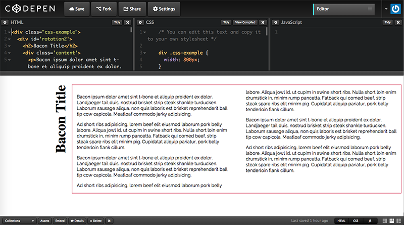
Media queries would be the best solution to acommodate for both situations. You will have to decide if the combination of Media Queries and Vendor Prefizxes is worth the effort. THe code looks like this:
See the Pen CSS Content Rotation Using Media Queries by Carlos Araya (@caraya) on CodePen.
It's not perfect, the boundary between the medium and large queries needs to be adjusted but it gives you an idea of where you can go with transformations.
This is just the beginning of what you can do. Mozila Developers Network (MDN) provides a very good overview of CSS transformations to show what you can do. You can also combine these transformations like what we did in example 14-2. It is not perfect. Even though you cannot see it, the width of the heading is too large and it creates unnecessary space between the editable code and the resulting example.... We should be able to get rid of it but I'm happy with the result as it is so far.
Because this is dependent on screen resolution (when is a pixel is not a pixel) you must test in your target devices. Also : Just because you can it doesn't mean you should. As great as transformations are they take time and may detract from your audience's attention.
Links and Resources
- CSS Transform (MDN)
- Using CSS Transforms (MDN)
Getting Fancy: Animating text
Depending on the context and the type of text you're using animations can be useful. CSS Animation Level 1 provides a way to animate CSS properties over time. It uses key frames to create the animations.
We will work through an example similar to the Mozilla Developer Network basic animation example. The same or similar process can be used for other types of animations. The first thing we do is work setting up the animations in the elements we want, in this case,h1. Also note that we have to set up each attribute twice and maybe 3 times: One with the Mozilla/Firefox prefix (-moz), one for Chrome, Opera and Safari (-webkit) and one without a prefix to prepare for when vendor prefixes are no longer needed.
The attributes we set up are:
- Duration: How long will the animation last
- Name: The name of the animation we will use. We'll define the animation below
h1 {
  -moz-animation-duration: 3s;
  -webkit-animation-duration: 3s;
  animation-duration: 3s;
  -moz-animation-name: slidein;
  -webkit-animation-name: slidein;
  animation-name: slidein;
}
Once we set up the animation parameters we need to define the animation. We also have to do this three times, One for Firefox, one for Webkit-based browsers and one without a prefix to future proof our code. Each keyframes selector defines a beginning and ending state for the chosen object. In this case we move h1 heading from left to right and decrease its width at the same time. All these tasks will be done in 3 seconds (as specified by the *-animation-duration attribute of the h1 tag.)
@-moz-keyframes slidein {
  0% { margin-left:100%; width:300%; }
  100% { margin-left:0%; width:100%; }
}

@-webkit-keyframes slidein {
  0% { margin-left:100%; width:300%; }
  100% { margin-left:0%; width:100%; }
}

@keyframes slidein {
  0% { margin-left:100%; width:300%; }
  100% { margin-left:0%; width:100%; }
}
There is another syntax available online that uses percetages. They are equivalent but I recommend using percentages since they make more sense when inserting additional steps for an animation.
This is just the beginning. We can add aditional frames to the keyframes selector to make the animation smoother or to add aditional steps and animation types to the process. We're also able to animate color transitions, like transforming the background color of an element through a series of steps.
There is also a Web Animations API editor's draft that allows developers to use JavaScript to create and control animations. I mention it here but wil not cover it as it's a Javascript API I'm still in the process of learning.
Just like with transformation: Just because you can it doesn't mean you should. As great as animations are they take time and may detract from your audience's attention. Animations can also cause performance issues that you need to consider.
Links and resources
Getting fancy: Shapes, masks and clip paths
CSS Shapes allow designers and content creators to match some magazines layouts where the text wraps around images and other polygonal and irregular shapes.
Why do I include shapes in an essay about typography? As you can see in the examples below, shapes change the way the text relates to the surrounding images. Imagine what we can do with irregular shapes or letters (thinking of Dropcap applications).It can also be used to create shapes with text inside the shape (this is not part of the level 1 specification and was deferred to level 2 which is currently a working draft.)
See the Pen Shape Outside Example by Carlos Araya (@caraya) on CodePen.
In the future we'll be able to use shape inside and exclusions to create magazine equivalent layouts and where creativity will be the driving force, not browser constaints.
Unfortunately there doesn't seem to be much traction with exclusions or full shapes support within the CSS working group (which means that browsers are far from giving us working implementations) so we have to resort to polyfills for shapes to account for incomplete spec support and older browsers that don't support the feature altogether. I am not a fan of polyfills but, even with all the limitations inherent to polyfills, seems like a good compromise for this particular situation.
According to the CSS Masking specification abstract:
CSS Masking provides two means for partially or fully hidding portions of visual elements: masking and clipping.
Masking describes how to use another graphical element or image as a luminance or alpha mask. Typically, rendering an element via CSS or SVG can conceptually described as if the element, including its children, are drawn into a buffer and then that buffer is composited into the element’s parent. Luminance and alpha masks influence the transparency of this buffer before the compositing stage.
Clipping describes the visible region of visual elements. The region can be described by using certain SVG graphics elements or basic shapes. Anything outside of this region is not rendered.
It has long been a trivial exercise to create masks and clip path images in Photoshop or Illustrator (and Photoshop CC makes it a really simple exercise as shown in the Lynda.com course Design the Web: Clipping Masks.) But until clip paths and masks became available in CSS you had to use an external tool to create these effects.
Examples and References
- Shapes 101 - A List Apart
- Getting Started with CSS Shapes - HTML5 Rocks
- Clipping and Masking in CSS
- Masking Tutorial
Getting Fancy: Blend Modes
Compositing and Blending Level 1 candidate recommendation provides a way to composite elements in HTML and SVG using CSS. Think of the way you can create non destructive clips and masks in Photoshop; the idea is the same but rather than use Photoshop we can use CSS in the browser. We'll look at the basics of CSS Blend Modes and some examples of their applications to text.
The specification is supported in Firefox, Chrome and Opera with partial support in Safari and, as far as I can tell, without prefixes (according to caniuse.com)
One of the first examples I found interesting is how to create masks in CSS. This pen, from Dudley Storey, illustrates the idea. The text, and only the text, will show the underlying image. The rest of the screen. See the acompanying article for more detail of the process and how to incorporate this into your own work.
See the Pen Text Clipping Masks with CSS Blend Modes by Carlos Araya (@caraya) on CodePen.
When you highlight the word Chicago you can see other parts of the image that were not used as part of the mask. The image itself has not been edited. THis is similar to how you can move the image when you do layer blending in Photoshop. The underlying image will move but the text will remain the same.
Tutorials and Links
Explorations and Experiments
Jen Simmons presentation at SFHTML5 - May 20, 2015 (There are some audio issues, be patient)
Jen makes a great point on her presentation. Where is the awesome layouts that we see in print reflected on the web? We are not tied into the "rectangular boxes" wisdom of the web. We have technologies like shapes, clip paths, masks and many other technologies that make square boxes almost obsolete.
Don't get me wrong... rectangles have their place and we shouldn't make all out content replicas of printed material but, Rather than takin the challenges and opportunities of print as a source of ideas and inspirations we became stuck in the Holy Grail layout (and we'll leave aside, for the moment, the fact that the Holy Grail Layout only became practical with the advent of CSS Flexbox as explained by Philip Walton.)
So what happens when you stop thinking about rectangular, Holy Grail style, layouts? You can start thinking of layouts like this:
You can compare the images above with images like the ones in the Noise versus Noise Flickr set where the creator has attempted to identify the actual content of websites in the midst of ads and other content that is irrelevant to the actual objective of the site.
Lea Verou's CSS Secrets is another good source of inspiration for CSS and how far to push the technologies. The book is based on two of her presentations: CSS3 secrets: 10 things you might not know about CSS3 and More CSS Secrets: Another 10 things you may not know about CSS and it provides crazy ways to use what we're already familiar in CSS.
Why can't it look like print? Why should it look like print?
One example of pushing the web: non-linear narratives
But it's not just whether we move the words around the box or the the boxes around the screen. It's also the way we incorporate web technologies (typography, new web APIs, new semantic HTML5 tags) into our written content to create more engaging user experiences and the way in which we interact with the content on screen accross a varitey of devices and form factors.
For the longest time we've been told that 'the web is not print' and we grew into holy grail layouts. A fair question would be to ask what's next. How can we push the boundaries of the web even further without loosing sight of accessibility and universal access?
The examples below
- An Idea Lives On
- Snow Fall
- The unkillable Demon King
- Scaling Everest
- Pixel Fable
- Una historia que da la vuelta
- Lost Nigeria
- Forest Giant Site
How tos and tutorials
- Forest Giant Case Study -- HTML5 Rocks
- How we made Snow Fall
Test the hell out of the project
When I use the term test in the context of typography I mean to test in as many systems and devices as you can nget your hands on. Not just to make sure that whatever bells and whistles you use work as intended but to make sure that the different form factors, smaller screen sizes and devices in particular, display the content in a way that matches the design as specified.
Critical Rendering Path and You: Why you should care
One final thing
For those of us who have been playing in/with 'the web' for 10 years or longer remember pages like the ones in the figures below. There was no Javascript and, I believe, the original CSS specification was released in 1996 so there was no CSS to play with.
Why do I bring this up? Because we've gotten spoiled by riches. We talk about critical rendering path, page load and web typography and that's good. But we forget that what may be an acceptable page load in Mountain View, California may not be acceptable in Thailand where the dominant form of Internet access is the mobile smart phone (Tech Wire Asia).
As Eric Meyer reminds us the web is more than just Javascript, CSS and the latest and greatest Framework, API or micro service. We need to make sure that the content is accessible whether we have CSS and Javascript enabled or whether they are in a broadband Gigabit connection or in a very slow dial up connection in Africa or India or for people using assistive technology devices.
This Web App Best Viewed By Someone Else - Eric Meyer keynote at Fluent 2015
As content developers we need to continually ask ourselves what would happen if we can't download the CSS or if the user has Javascript disabled. We need to make this a part of our testing and development process.
In the web front-end stack — HTML, CSS, JS, and ARIA — if you can solve a problem with a simpler solution lower in the stack, you should. It’s less fragile, more foolproof, and just works.